Sonntag, 9. Oktober 2011

Erica Awanos The Complete Alice in Winderland

This is one of the greatest comic versions of Alice in Wonderland to date. It was published in 2009 by Dynamite Entertainement, New Jersey as a four issue miniseries. The first two issues cover Alice in Wonderland while the third and forth issue cover Through the looking glass.
The wonderfull artwork was done by the japanese-brazillian manga artist Erica Awano. I really love this comic! First of we have Issue 1.
I love the design of alice. She looks adorable and bratty at the same time. The colours are another thing that I love here, they remind me in the Arthur Rackham Illustrations of the book.
Wonderfull sequence here, as the "camera" zooms in while Alice shrinks down.The design of the hall of doors is great.
Panel four is cool when she she talks to her reflection. Her expresiions while eating the cake are wonderfull too.
This page is a thing of beauty, wonderfull as she grows as tall as the room and the last panel when she just knees down and cries.
Some beautyfull perspectives here.
And she shrinks down again. This is also a very gorgeous sequence.
And so she falls in the lake of tears, ending the hall of doors scene.
And alice enters the very Rackhamesque looking house of the White Rabbit. And drinks something she shouldn´t drink.
The effect is isntantous and soon she fills the room. Compare her grumpy expression to Tenniels version of the same scene that I reviewed earlier.
Bill gets kicked. What makes this comic great are all the little details like the strands of her hair that are hanging in the chandelier.
Again, great expression as she inspects the tiny cake on the tip of her finger.
Alice tries the mushroom ans shrinks instantly so small that her chin hits the top of her shoes. Few, very few artists do actually draw this scene like that, I believe they shy back from the shire grotesque appearence of this scene. I think it should be reimaged more often. First of all because it is that way that Carroll has written the scene in the book. Second this is too wonderfully bizarre to leave it out.
And suddenly her neck is too long. Again the details like the random twigs in her hair.
She snakes her long nck down and manages it to get to a moore adequate size. This end the size changes in Issue 1.
Issue 2 contains as I mentioned before the second half of Alice in Wonderland.
Alice is back in the hall of doors and this time she does everything right.
The courtroom growth is brilliant. You gotta love how subtile it is done in the background as the shenannigans of that justice farce unfold in the foreground.
And she destroys the spectators box.
Some nice perspective shots in alices evidence. I love the panel as she looks down on the king and queen.
And the pack of cards rises and attacs her, thus ending the dream.
What can I say? I truely and genuinely love this comic. There gase been a TPB released lately, go and check it out.

Samstag, 8. Oktober 2011

Dalmatians Press Alice´s Adventures in Wonderland

Here is another american publication of the book, this time published in 2001 by Dalmatian Press, Tennesee.
It was illustrated by Jason Alexander, who is also quite famous as comic artist. He illustated  for example Abe Sapien: The Drowning for Dark Horse, DC´s Gotham Central and stuff for Poison Elves. He did a quite half-assed job here, concerning his talent. When you look at some of the weird poses and thewonky anatomy, you get the feeling he didn´t cared much for this job. Howwver, lets look at his takes on Alices sizechanges:
Tiny Alice in the Hall of doors about to eat the "EAT ME" cake.Her left leg really looks weird here.
Now she is large and her right arm looks off. I mean really, this guy IS a good artist, why does he keep on screwing up the limbs like that?
This one looks actually pretty good. Nice splashpage with neat perspective.

Now we´re in the White Rabbits house Alice is about to hit the bottle again...
Another nice splashpage, but again her arms and legs look so fat! I think I might have an ide why he was doing that. As a comicartist he was so used to drawing sexy young women that he was not used to drawing children. He was allready starting to draw Alice like a young woman (you can see that by the face which looks way too old for a 7 year old girl) when he stopped himself at her arms and legs, because thats when he noticed that he drew them way to slender and shapey. So he made them much thicker because everybody knows kids have chubby short arms and legs. Results may vary, but who cares? This book is for kids and they have not only chubby short arms and legs but are also morons who dont see that whe didn´t care for this job.
Just look at the arm, you can see that he first drew it much more slender and then overdrew it!
Not much to say here, Alice is about to eat the cake that will shrink her out of the white rabbits house.
Long neck Alice after eating the shroom.
This one here is pretty nice since its IMHO no made often enough. Alice approaches the house of the Ugly Duchess and notices that she is much too big for it. Even Alices proportions look nice here.
At the court: Alice trows over the jury.
Alice is giving her evidence. Somthing about the way she stands looks very off, but I can´t quite put my finger on it...
More from the court with another odd pose from Alice. She looks like her stomache hurts.
Last splashpage in that book. Alice has another strabnge pose, but whats wrong with her dress? Something is seriously wrong here. Just look how it billows tio her right side for some unexplainable reason while beeing skintight on the left.
Alli in all a okay version. There are many illustrations in it, but they are all not very good. It all looks rushed and sketchy. Oh well, next up is a VERY good comic version..

Sonntag, 2. Oktober 2011

Alice comic by Lela Dowling

Here is another very neat comic version.
 The cover looks like a VERY  cheap photoshop... The comic was published in 2004 by About Comics. Artist is Lela Dowling.
I kinda like Alices unusual design in this comic. Dress and Pigtails remind actually a bit in Dorothy from the wizard of Oz.

 
Thats a very neat idea for Alices shrinking in the hall of doors. She shrinks actually on the page untill she is to the reader not much more than a dot on the paper.
And up she goes. I really like how grotesquely streched out Alice looks here. You get a good idea of her bigness.
And she is back to tiny.
 
The scene in the White Rabbits house. Not much to say here, its well done but it didn´t really impress me as much as the hall of doors scene.


 Now thats nice. I think this is the first version of Alice I´ve ever seen that actually enjoys the really long neck the mushroom of the caterpillar gave her, untill she runs into that dumb pidgedon that is...


Alice grows again in the court room. I alwys preferd the versions where she slowly grows like here over those where she spontaniously pops huge.


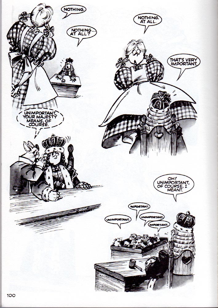
Alices evidence. Nice play with perspectives here. I also like the idea of her stepping accidentally onto the queens table.
All in all a very nice comic. The art style is quite cartoonish but that works overall very well with the book. Its still available via Amazon.